
Recognised in the Top 50 in India, highlighting my ability to combine conceptual depth and typographic storytelling effectively.
BACKGROUND
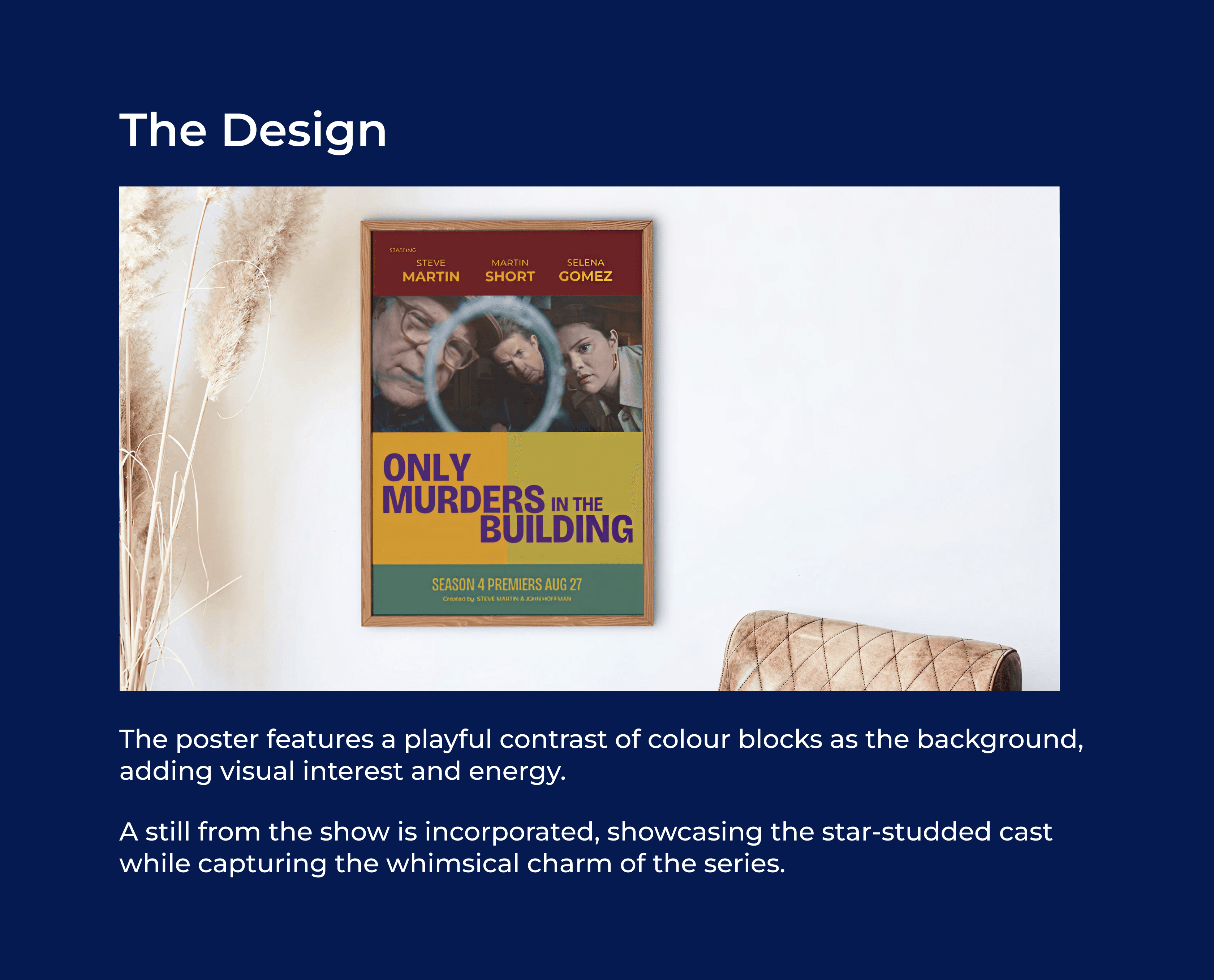
This week’s font pairing instantly reminded me of Agatha Christie’s classic whodunnit book covers. Inspired by these influences, I chose my current favourite mystery-comedy series, Only Murders in the Building, for this design challenge.


Designed for readers who seek a visually striking yet intellectually evocative cover.
The balanced use of negative space ensures clarity, guiding the reader’s attention to the title while inviting curiosity about the narrative.
Reflect the intellectual depth and emotional journey of the protagonist through typography and minimalist design.
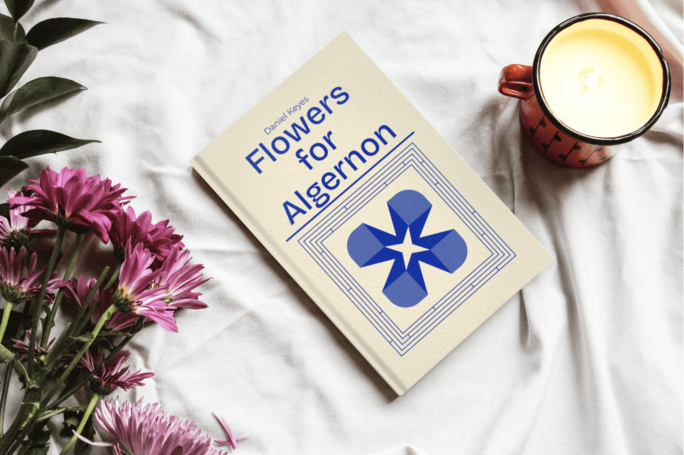


Designed for readers who seek a visually striking yet intellectually evocative cover.
The balanced use of negative space ensures clarity, guiding the reader’s attention to the title while inviting curiosity about the narrative.
Learnings
I gained valuable insights into integrating typography and narrative contexts to create meaningful, user-centered designs.
I also realised how researching font histories and cultural contexts can significantly elevate the quality of my work.


